

Data visualization is a process for creating the visual representation of data. At its core, data visualization allows us to visualize data and communicate insights. This is a critical part of data science, For clearly understanding data, we represent data using graphs, plots, and other pictorial representations in the case of numerical we use dots or bars, or lines.
As we all know, the pictorial representation is very easy to understand the data and it will be helpful to find the errors in the data like outliners, etc. using a graph or other picture representation we can represent a huge amount of data and will be easily understandable. It allows key personnel to make data-driven decisions.
Exploratory data analysis is used by the data experts for analyzing and learns about the dataset details and about the relation and characteristics them.
A data scientist starts with us trying to understand and make sense of the data during the data analysis phase of the machine learning workflow. This process is called exploratory data analysis (EDA).
EDA is crucial to understanding the underlying structure of the data. It helps to understand the relation of dataset variables between them. Exploratory data analysis is a widely used method by data scientists. With the help of EDA, we can understand the data much more than conventional methods. During EDA, we examine data using graphs to begin:
During EDA, we can also check the underlying assumptions we make about the data. By visualizing the data distribution, we can see what statistical techniques and machine learning models are appropriate for a given analysis.
There are different plots that are used to visualize data, we need to understand some of them for moving further that include
Scatterplots display the relationship between two variables using dots mapped along a horizontal axis (x-axis) and vertical axis (y-axis). Each dot represents an individual data point associated with each feature. If the point trend in certain order there is some relation between the data. If the scatter plot is fully dispersed then we can expect there is no relation between the data variables.
We will visualize the Iris dataset, a classic dataset that contains measurements of the length and width of the sepals and petals of three species of Iris flowers.
from sklearn.datasets import load_iris
import matplotlib.pyplot as plt
import numpy as np
import pandas as pd

# Load Iris dataset
iris = load_iris()
To simplify the data visualization methods, we'll create a Pandas data frame.
# Load the feature data and the label-encoded target variable.
df = pd.DataFrame(data= np.c_[iris['data'], iris['target']],
                 columns= iris['feature_names'] + ['target'])

# Concatenate the Iris species names.
df['species'] = pd.Categorical.from_codes(iris.target, iris.target_names)
print(df.head(10))
sepal length (cm)  sepal width (cm)  ...  target  species
0                5.1               3.5  ...     0.0   setosa
1                4.9               3.0  ...     0.0   setosa
2                4.7               3.2  ...     0.0   setosa
3                4.6               3.1  ...     0.0   setosa
4                5.0               3.6  ...     0.0   setosa
5                5.4               3.9  ...     0.0   setosa
6                4.6               3.4  ...     0.0   setosa
7                5.0               3.4  ...     0.0   setosa
8                4.4               2.9  ...     0.0   setosa
9                4.9               3.1  ...     0.0   setosa

[10 rows x 6 columns]
Now we'll grab the seoal length and sepal width data, and plot the relationship between the two.
# Grab data
features = df[iris.feature_names]

# Make scatterplot and labels
plt.figure(figsize=(4, 3), dpi=200)
plt.scatter(x=features[iris.feature_names[0]],  # Sepal length
            y=features[iris.feature_names[1]],  # Sepal width
            c=iris.target,                      # Iris species type
            cmap='viridis')                     # Color for each Iris species
plt.title("Sepal length v. sepal width")
plt.xlabel(iris.feature_names[0])
plt.ylabel(iris.feature_names[1])
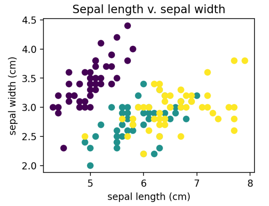
Shown is the relationship between sepal length and sepal width. Each dot color corresponds to a different species of Iris. From the scatter plot, we can conclude that:
• Sepal length and width are positively correlated with each other, and
• The species corresponding to purple is highly separable from the other species, potentially indicating it is unique.
Scatterplots are much harder to interpret with more than 3 features, limiting their usage to small and lower dimensional datasets.
Barplots display the relationship between categorical data and numerical data associated with each category. The numerical data can represent anything from counts to essential metrics (e.g., mean, median, mode).
from sklearn.datasets import load_iris
import matplotlib.pyplot as plt
import seaborn as sns
import numpy as np
import pandas as pd

# Load Iris dataset
iris = load_iris()

# Grab data
features = df[iris.feature_names]

# Make barplots by Iris species
plt.figure(figsize=(3, 2), dpi=200)
sns.countplot('species', data=df)

# Plot attributes
plt.title("Iris species counts")
plt.xlabel("Iris species")
plt.ylabel("Frequency")
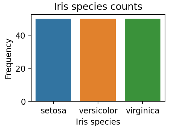
The barplot shows that the dataset is well balanced. There are equal Iris species in the dataset. This is important in a classification problem - the more unbalanced the dataset is, the harder it is to predict other classes.
Histograms are like the bar graph but it is used to check the frequency rather than the trend. Histograms reveal the underlying data distributions for continuous data. One axis shows the data value, while the other axis shows the frequency of the datapoint within a given interval or bin.
from sklearn.datasets import load_iris
import matplotlib.pyplot as plt
import numpy as np
import pandas as pd

# Load Iris dataset
iris = load_iris()

# Load the feature data and the label-encoded target variable.
df = pd.DataFrame(data= np.c_[iris['data'], iris['target']],
                 columns= iris['feature_names'] + ['target'])

# Concatenate the Iris species names.
df['species'] = pd.Categorical.from_codes(iris.target, iris.target_names)
print(df.head(10))

# Grab data
features = df[iris.feature_names]

# Make histogram and by features
features.hist(figsize=(10, 10))
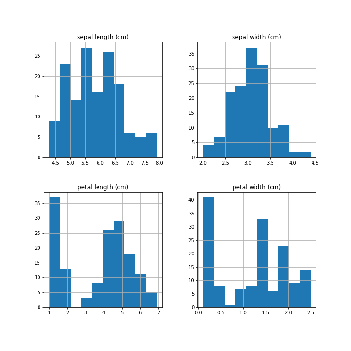
These histograms show that each feature has a different distribution. This variance in the data allows the machine learning model to classify data.
Heatmaps are basically a matrix that is color-coded. That means each cell of the matrix is colored ranging from green to red depending on the value or the risk of that variable. As we all know green is a healthy cell and risk increases when it moving towards red. It is more understandable than the numbers.
Heatmaps help us visualize multivariate datasets that may have multiple features. They create a visual map of the relationship between any two pairs of features and/or observations. The values can be the raw data points or some aggregate metric.
from sklearn.datasets import load_iris
import matplotlib.pyplot as plt
import seaborn as sns
import numpy as np
import pandas as pd

# Load Iris dataset
iris = load_iris()

# Load the feature data and the label-encoded target variable.
df = pd.DataFrame(data= np.c_[iris['data'], iris['target']],
                 columns= iris['feature_names'] + ['target'])

# Concatenate the Iris species names.
df['species'] = pd.Categorical.from_codes(iris.target, iris.target_names)
print(df.head(10))

# Make Heatmap
plt.figure(figsize=(4, 2), dpi=200)
ax = sns.heatmap(data=features.T)

# Heatmap attributes
ax.set(xticklabels=[])
plt.axvline(x=50, c='black')
plt.axvline(x=100, c='black')
plt.title("Iris data heatmap")
plt.xlabel("Individual data points")
plt.ylabel("Features")
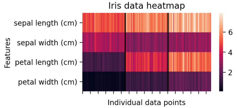
This heatmap shows the raw data values. The black lines accentuate the separation between three different Iris species and individual feature values.
Boxplots are concise ways to visualize data and some helpful summary statistics associated with the data.
from sklearn.datasets import load_iris
import matplotlib.pyplot as plt
import seaborn as sns
import numpy as np
import pandas as pd

# Load Iris dataset
iris = load_iris()

# Load the feature data and the label-encoded target variable.
df = pd.DataFrame(data= np.c_[iris['data'], iris['target']],
                 columns= iris['feature_names'] + ['target'])

# Concatenate the Iris species names.
df['species'] = pd.Categorical.from_codes(iris.target, iris.target_names)
print(df.head(10))

# Make boxplot
plt.figure(figsize=(7.5, 5))
plt.boxplot(x=features.T, labels=iris.feature_names)

# Plot Attributes
plt.xlabel("Features")
plt.ylabel("Measurements (cm)")
plt.title("Iris data distribution")
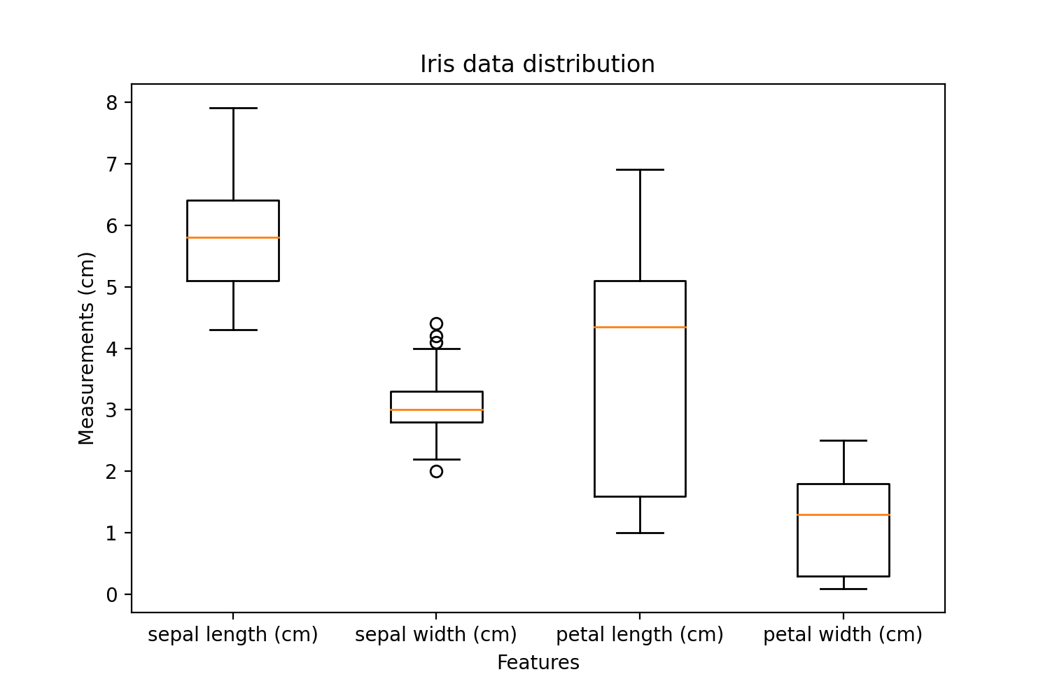
The orange line represents the median value. The entire box shows the spread of values acceptable within the upper quartile and the lower quartile - basically 50% of the data. The whiskers represent the top and bottom 25% of the data, excluding outliers that are the dots on the top and bottom of the whiskers. Whiskers can be defined as the vertical lines reaching max and min from the box
Some data points in sepal width are classified as outliers outside of the quartiles. This shows that the sepal width contains some noisy data. Interestingly, petal length has a highly varied distribution of values compared to other features. This indicates that it may not be a useful feature to separate Iris classes.
Data visualization is a graphical representation of data and exploratory data analysis is used by the data scientists to analyze and learn the relation between the data with help of data visualization.
We use different methods to visualize data graphically that include scatter plots, bar charts, Histograms, Heat maps, and box plots. All the methods represent the data variables and some of their relations, risk, frequency, or statistics in between the data variables.